Showing posts with label 1 in 3. Show all posts

Friday, 9 May 2014

So the journey continues - Logo development!

Following feedback from my tutor I have developed further my original logo taking inspiration from shapes and images associated with cancer and cells.

Top left of the 1st batch of images shows inspiration images and top right is my colour scheme for the project.

Sheet 1 development

Sheet 2 - development

sheet 3 - development


Monday, 5 May 2014

Final honours book

As part of the honours project, as the work is to be gathered together into an e-book and a formal presentation to the panel with take place next Monday!

I have started to create layouts using in design - Its a slow but therapeutic process.


Wednesday, 30 April 2014

Inside the exhibition!

Within the exhibition stand I want to just display simple graphics that will inform the public of cancer.

I have began to design the graphics to go within the stand. I have also produced a series of plans & elevations of the stand. These will also indicate circulation plans, lightening plans & fixtures, and the position and size of the signage within the stand.

I will also indicate which font is to be used within the design and also the size of the fonts.

Plans & elevations indicating position of graphics


Graphics to be used within the exhibition stand

Plans & elevations showing  graphics position on the left side

Graphics within the exhibition stand for the right side.

Plans & elevations showing graphic positions & placement


Tuesday, 29 April 2014

Render or not to render….

I now have a final design for my exhibition stand woo hoo!!


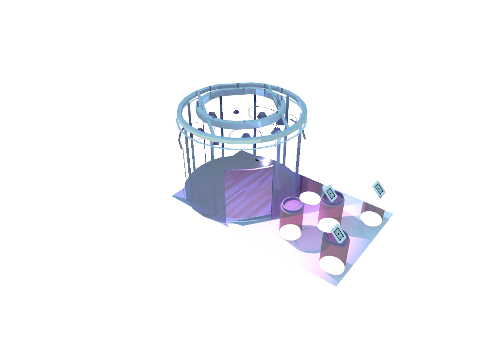
The rationale of the exhibition stand is driven from cancer research itself. The main body of the stand and the small podiums at the front have been inspired by a test tubes as this is one of the main instruments with researching cancer. 

The lightening fixture within the stand has been inspired from the shapes found in a microscopic cancer cell.

I have kept the colours in keeping with the honours project and this is also based on the stains that scientists use to distinguish the difference between a normal and cancer cells.

I now have the challenge of rendering it in a rendering programme. As mentioned in earlier posts, I used Indigo however I wasn't pleased with the results, so the search continued for another rendering programme and I discovered 'Podium V2'


The above images show the different effects that can be achieved through rendering. 

By taking one of the rendered images and adding other images within photoshop and also a customer or two,  the design was finally coming to life!
Final design for Exhibition stand

I have also added in different backgrounds and also placed the design in situ.


Saturday, 26 April 2014

Designing a logo!!


As part of the honours project, a promotional design package will be designed to assist with the marketing and promotion of the concept.

One of the major parts of the promotional package is a logo for the concept.

I have began to design logo concepts based upon both the current logo which is used for Anthropologie and also a strap line for the concept.

Selection of Anthropologie logos


Font used within Anthopologie logo

Font which is currently used within Anthropologie publications

Font which is currently used within Anthropologie publications

Concepts for a new logo


 I have drafted a spider diagram with ideas for the strap line which I could use for this project. 'Anthropologie' means to study the behaviour of human beings and within this project I would like to shock and create a reaction within a person, therefore I have wrote idea which I feel would best fit with this idea in mind.


Spider diagram of strapline ideas

Straplines ideas includes:- 'The Journey', 'Reflection', '1 in 3', "Inspiration', 'Beauty and the beast' and 'inside out'

The two which I feel best fit are '1 in 3' - 1 in 3 people develop cancer within their life time and 'The journey' as a person goes through a journey through life and my journey with my dad has inspired this project.


Concepts for '1 in 3' logo

Fonts which I feel suit the brand and I have used within the development of the logo
Logo development for '1 in 3'

I am still developing further this logo.


01 09 10