Thursday, 13 March 2014

Making plans for after graduation! - Employability workshop at Creative source

I am now thinking about possible career plans for after I graduate from this degree.

In the past I have often applied for artworker/ designer position, quite often through agencies.

This morning I received an email from creative resource, which is a recruitment agency for the design industry.

On Saturday 15th March , they are holding a Student Employability Workshop.This is aimed at graduates like myself and also students from years 1 and 2 to attend to prepare and help us to succeed within the creative industry. 


Portfolio and CV reviews will take place during this workshop along with tips from an industry professional on how to stand out from other graduates.

I am signed myself for the afternoon slot! 

After also finding out about the workshop,I decided to take a look at the Job section on the website.  There was several junior designer / artworker positions on offer so I have applied for both positions advertised.

Lets see what saturday brings!

Sunday, 9 March 2014

Slowly piecing together the puzzle!

Slowly my honours project is now taking shape. 

However at the moment I am struggling to gain access to WGSN - the trend setting website used by the fashion industry,  so hopefully I will be able to produce more trend mood boards.

Here is a selection of mood / research boards I have produce so far for this project.

These following four board are based upon my retail brand - 'Anthropologie' , this section will be continued to be updated as I am forever finding out facts, figures and statistics for this brand.

So whats this space!!

Anthropologie - Current Corporate Identity.

Anthropologie - Present  Customer Profile

Anthropologie - Brand Values

Anthropologie - Philosophy

Radiant Orchid is the pantone colour of the Year 2014. Keep an eye out for an update on this section (once I have log in details for WGSN!)

Trends 2014 - Pantone colour of the year
 By researching into the founding year of Anthropologie - 1992, I wanted to find links within the brand and my theme of cells.  how thrilled I was when I came across this information.

An obvious link is the name 'Anthoropologie' , which means the behaviour of human beings, however I wanted to dig deeper and found something more clever and unusual.

Edwin G.Krebs (1918-2008) and Edmond H.Fischer (1920) were both awarded the Nobel Prize in Physiology and medicine in 1992. They were awarded it for the discovery  of reversible protein phosphorylation as biological mechanism.

Phosphorylation is the action of regulating protein and transmitting signals within a cell.

 So whats protein got to do with a cells I asked myself, well proteins are in-fact the building blocks within a  cell .They determine nearly every task of a cell's life, this includes cell shape, inner organisation, product manufacture and routine maintenance.


World Events of 1992 - Nobel Prize winners

So basically they both discovered how to switch the function of a cell on and off. which has later helped develop a break through within the development of cancer treatment along with other illness to.

A hormone signal will act on a protein within or on a cell and this will then send further series of signals which will then tell the cell to produce by diving. However a mutation (a gene which maybe lost or damaged) can occur and this can result in either too much protein being produced or not enough is made.

It can take a long time before mutations happen for a cell to become cancerous and this is why most types of cancers are more common in the elderly.


This Video by Cancer research Uk explains how this process works .http://youtu.be/m5_yo6uEeEc
The discovery by Krebs & Fischer has lead to scientists being enable to develop cancer treatments such as chemotherapy, radiotherapy and others as they understand now how to switch the off the functions of a cell.
This has certainly been on hard lesson to learn as I do not understand cell biology at all, but through the help from both friends and family I have managed to piece together a general understanding of this development.
Any way this is another step forward into piecing together the jigsaw pieces within my honours project.

Thank you Krebs & Fischer for your discovery!!

inspirations = paintings, paintings and more paintings

Now the fun part has started!

I have begun to research into cancer cells, their form, texture, patterns and colour combinations in preparation to my visit to the cancer research lab in Manchester next week.

I am working in a small A5 sketchbook at the moment to collect my findings. This sketchbook will record research, statistics, anything that I am inspired by within this project and also my own experiments and samples that I have created.

Below are a series of images that I have already created which have been inspired by cancer cells.

Hope you enjoy them!


My inspirations!

Prostrate cancer cells 

Corpora Amylacea - (prostrate cancer)

Esophageal cancer cells

(l) abdominal cells and DNA filtering

More esophageal cancer

More esophageal cancer

Friday, 7 March 2014

Cancer cells as art!


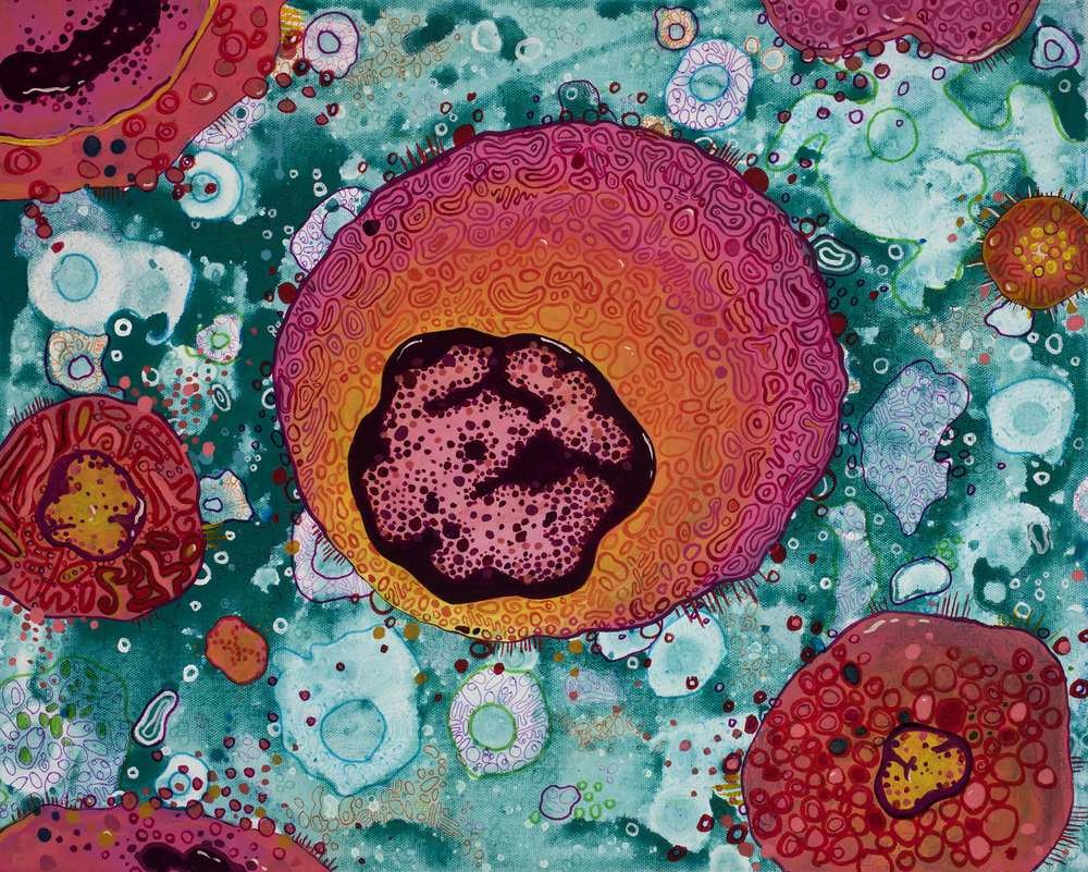
Cell No 4 - Angela Canada Hopkins


Furthering my research into cancer cells and their forms, I came across an artist - Angela Canada Hopkins.

Hopkins, like myself lost her father in June 2001 to cancer and she too decided to channel her emotions through art and design.

'Cancer is a difficult subject to tackle, but when it touched my life, I took inspiration from the challenge.
After my father died from cancer in June 2001, I decided the best way to overcome my new "enemy" was by embracing it through art.  I initially painted the disease by deconstructing microscope slides of cancer cells and reinterpreted them.  Creating the work has deepened my understanding of the disease and changed my outlook.  Recently, my work has progressed to a more abstract style that references general characteristics of molecular patterns and shapes. '
                     
                                                            Taken from - Angela Canada Hopkins -About me section.
                                                                          http://angelacanadahopkins.com/about/

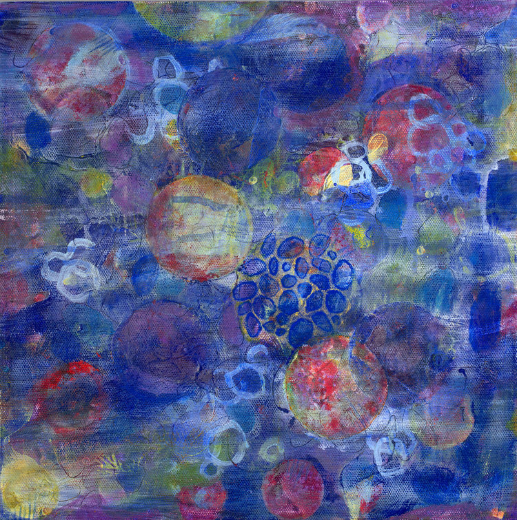
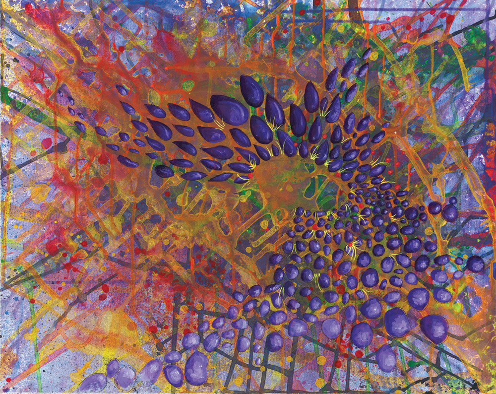
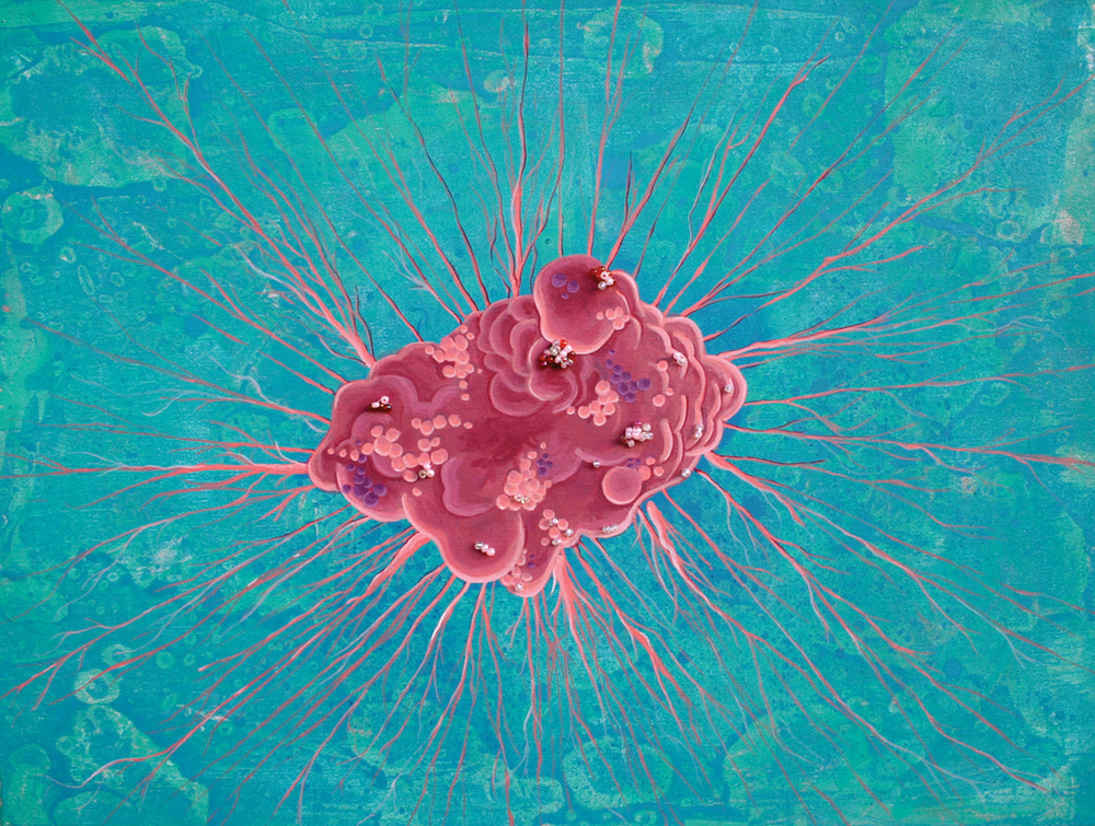
Hopkins takes slides of the microscope cells and creates her own interpretation. She wanted to make something positive and replace her negative thoughts on the subject matter.

I feel that her painting are bright and colourful, although I am aware of what they are, I feel comfort by looking at her images.

I hope to create a similar feeling as Hopkins has done through her work, and raise awareness within the viewing public, without them realising the true extent of the images content.

Hopkins images are now being used within a variety of commercial places, with recently a painting was chosen for the jacket of a novel by 'The Abundance: A Novel' .

Rich Pratcher , art director at Henry Holt and Company, who sought out Hopkins work, says 

“I thought the description of the unusual beauty in something so destructive fit harmoniously with the novel"


Details of Hopkins' website is http://angelacanadahopkins.com
Cell No 21 - Angela Canada Hopkins

Cell No 8 - Angela Canada Hopkins
Cell No 15 - Angela Canada Hopkins


All Images used with kind permission from Angela.


Wednesday, 5 March 2014

Model making has started!

Carrying on from my post entitled…square, square and more squares', I have started to mock up using textured card and acetate the layout of my retail store.

By mocking up the layouts this way it allows me to see how my store will eventually look and also me to evaluate the layout of  different fixtures and fittings. I have decided already on some of my mock ups that I want to have less fixtures in and I want to move them around already.

Below is images taken of my mock up layouts so far. I have also tried to take the images as close to eye level as possible.

As close to eye level as possible

Overhead view


Alexander McQueen does fairytale fashion - PFW 2014

So this week has saw the launch of Paris Fashion week.

Chanel has showcased its own supermarket , which I personally though was so different and unique. Something which i feel the catwalks can sometimes lack, I think Karl Lagerfeld maybe taking a leaf out of the late Alexander McQueens book!

Chanel - Paris Fashion Week 2014

This brings me to on one of my most favourite designers of all time - Alexander McQueen (1969-2010)
Lee 'Alexander' McQueen - (1969 -2010)


Alexander McQueen (1969-2010) was one of the most controversial fashion designer during his time, and his antics earned him the title 'l'enfant terrible' or the 'hooligan of british fashion'. McQueen undertook a masters at Central Saint Martins in London and it was here, presenting his graduation collection based upon Jack the Ripper, that he was discovered by Isabelle Blow (1958-2007).

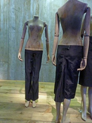
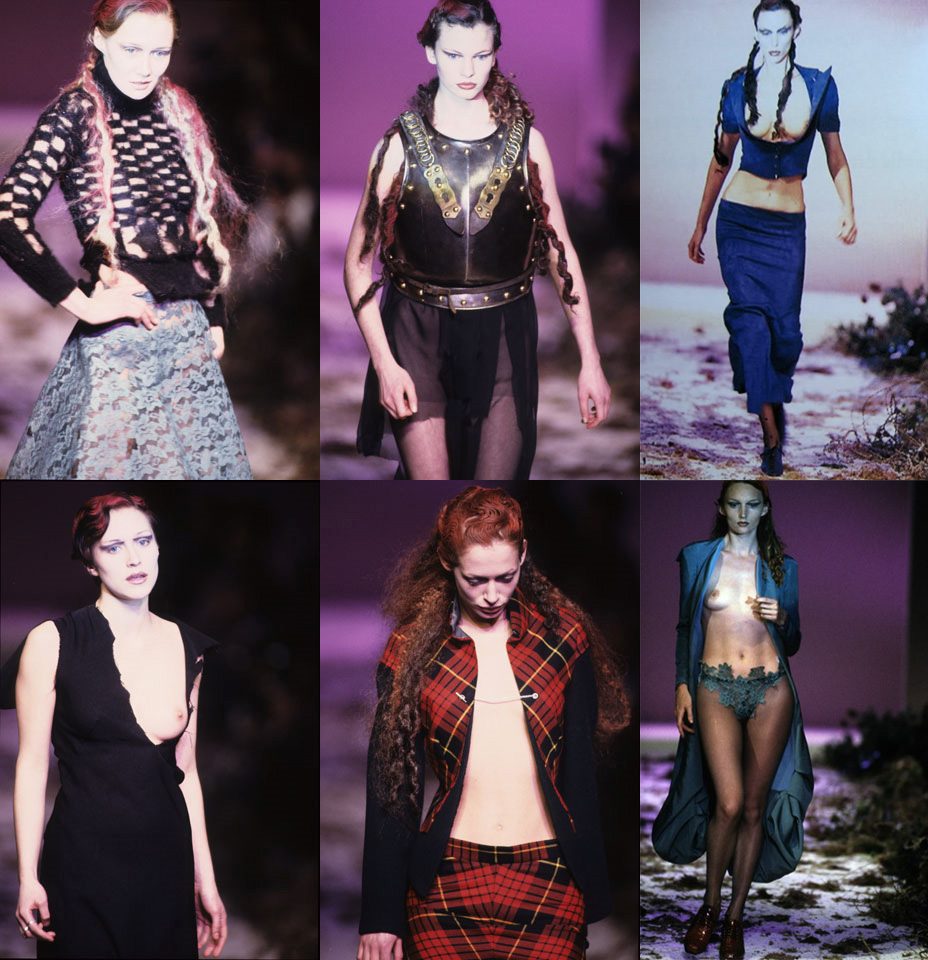
During his career, McQueen liked to shock his audience. He is most famous for his 'bumster trousers', which premiered in the collection 'Taxi Driver -1993',  A collection entitled 'Highland Rape - 1995' which featured torn bodices and tampon strings hanging from the skirts amongst many others. 

McQueen - Bumster trousers 1996

McQueen - Highland Rape collection - 1996
McQueen committed suicide following the death of his mother, Joyce from cancer in February 2010 . It was uncertain at this point if the brand would continue. 

Sarah Burton (1974) who was once an intern with McQueen during his early years and has basically been with the brand since the start , was chosen to continue the legacy of McQueen.


Sarah Burton - Current Creative Director of Alexander McQueen

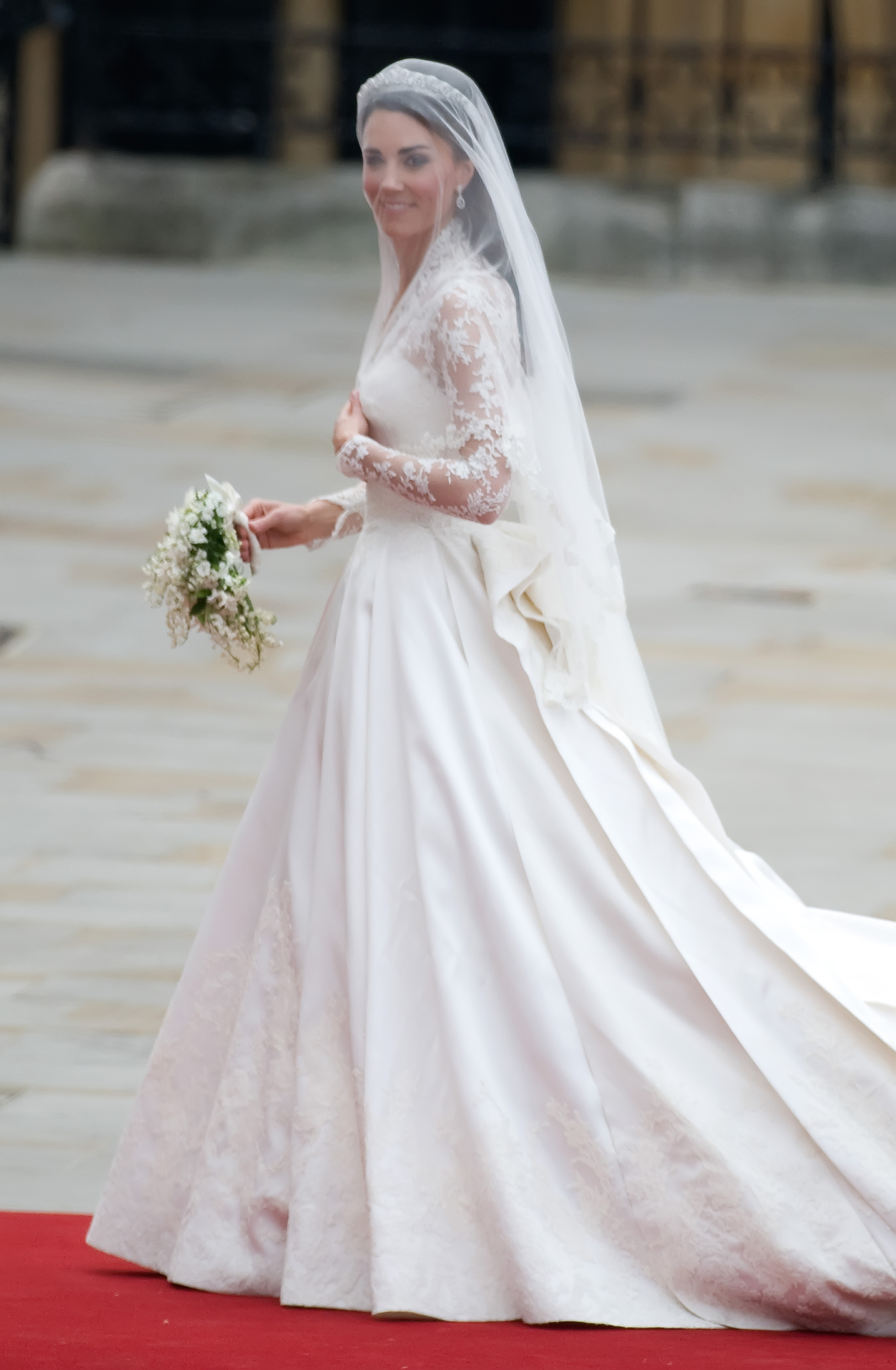
Burton's collections to date I feel have been less tailored and far removed from the designs that McQueen produced. Burton is famous for the wedding dress of The Duchess of Cambridge - Kate Middleton

Kate Middleton
Wedding dress by Sarah Burton (Alexander McQueen)

I am very intrigued by McQueen and were he gained his inspiration from therefore I based my dissertation upon McQueen's shock factor. He would take mundane negative subjects such as 'rape', 'death' and prostitution and turned them into beautiful, positive objects. This factor gave me the overall inspiration for my honours project.

Tuesday 4th March saw the launch of Alexander McQueen Autumn/Winter 2014 womenswear collection. 

My personal opinion straight away is 'WOW' and it is clear that Burton has gone straight back to McQueen's roots! The collection I feel has so many influences and is reminiscent of 'Highland Rape -1996'. Burton says the collection is inspired by:-

"It’s beauty and the beast, a wild beauty. And there’s kind of an innocence, but stripped back and liberated,"

http://www.independent.ie/woman/fashion/alexander-mcqueen-does-fairytale-fashion-at-pfw-30065490.html

Gone are the delicate fitted silhouettes from previous collection, and in there place are dark, romantic  garments, which I feel are more true to the style of McQueen. 
A/W 2014

A/W 2014
\

I also feel that the catwalk presentation is also reminiscent of McQueen's style. Although not as dramatic as his was, you can certainly see from the video that elements of his are starting to come coming through from previous catwalks. 


Long Live McQueen!!! 


Sunday, 2 March 2014

Squares, squares and more squares = Store layouts!

Using the measurements given in the honours brief (15mx15x5m) , my task is to create 10 initial store layouts and identify the one exterior shape that I feel would work best for this project.

First stop I thought was to to research into how Anthrolopogie plan their store layouts, and how their customers are lead around the store. I found a very interesting website http://www.pompeiad.com/work/anthropologie

Pompei A.D were commissioned in 1992,  by Anthropologie to develop their concepts for instore environments. I found this very interesting as Anthropologie use the store to create small sections / enviroments to not only entice their customers but also to enhance further sales.

 I am very intrigued by this and feel that could work really well with my theme of cancer cells. Below is a series of inspiring images which have been placed within my interiors sketchbook.


I have also taken into the account during the design process of the store layout. I have figured that if the layout of my store is very complicated, my ideas of introducing small interactive areas may not work as well. I have not completely dismissed the use of an unusual store layout shape but I feel the simpler the better.


Above are examples of store plan layouts. A colour and symbol key indicates were certain features will be within the store and I have also added a piece of acetate over the top of the layout to indicate customer circulation and how they will interact with the features within the store to.

I also thought about two storey store designs too. I could expand the features within the store over two floors - again I have used a colour and symbol key to indicate features such as window displays, in store displays, and also cash and wrap desks. A circulation plan has also been added to .


So now the task of deciding which layout I feel will best work for my brand - 'Anthrolopogie' and I will then develop this further via paper mock ups and in both google sketch up and AutoCAD.

Exciting times ahead!! 


01 09 10